
Altis Works: Barcelona, Lisbon, Paris
The 3 key insights you need if you’re planning to open an office here
Opening an office in a new city is not just a matter of square metres. It is a strategic decision that impacts costs, operations and positioning. Here are the key insights to help navigate these three European hubs.

Barcelona
Barcelona presents a clearly defined dual scenario: on one side, the city centre (Eixample, Gràcia), with attractive but constrained and less flexible buildings; on the other, the 22@ district, where contemporary offices designed for tech companies and hybrid working models are concentrated. Demand remains strong, but the market has become more selective and values are gradually increasing. Fit-out costs are still relatively competitive compared to other European capitals*, but timelines should be carefully considered: permits and regulatory requirements can significantly extend delivery. Key insight: if flexibility and scalability are your priorities, 22@ remains the most efficient choice today — but it requires earlier planning than in the past.
Lisbon
Lisbon is one of Europe’s most dynamic cities for new office openings, but its real estate market is maturing rapidly. Central areas (Chiado, Avenida da Liberdade) are experiencing rising costs and limited stock**, while districts such as Parque das Nações offer more modern and accessible spaces. The real challenge here is availability: demand is high, and ready-to-use spaces are scarce. Key insight: entering early and working with a local partner can make a significant difference in ensuring a smooth project rollout.
Paris
Paris remains a highly structured and competitive market. The historic centre offers prestige but comes with significant constraints in terms of customisation and intervention, while La Défense provides more standardised spaces that are currently more exposed to vacancy dynamics. The market is increasingly driven by a flight to quality logic: prime assets continue to perform, while others struggle. Rental and outfitting costs are among the highest in Europe, requiring extremely precise planning***. Key insight: there are compelling alternatives in emerging districts (such as the 10th or 11th arrondissement), where it is possible to strike a balance between identity and budget.
Discover more about how we work at https://altis-project.com/why-altis-about/
* Fit-out costs typically range between €600 and €900 per sqm, keeping the city relatively competitive compared to other European hubs (Cushman & Wakefield, EMEA Office Fit-Out Cost Guide 2024)
** Prime rents range between €330 and €420 per sqm/year (Savills, 2025)
*** Prime rents in the CBD often exceed €900 per sqm/year (CBRE, 2025)
Holiday Mindset: when your mind realises it’s December
In December, something happens that has nothing to do with decorations, panettone, or gift algorithms. That something happens in your head. Neuroscience refers to it as anticipatory cognition: as a transition approaches, the brain adjusts attention, motivation and perception of the surrounding environment. In wellbeing psychology, a related concept appears: the anticipatory relaxation response, when the body begins to slow down even before an actual break begins. This is what happens every year with the measurable, recurring holiday mindset: a slight detachment from routine that should not be read as distraction, but as a neurocognitive necessity. The mind settles in, much like that tree covered in baubles and lights in your living room.

When attention starts to drift
We stop noticing familiar details like the colleague speaking too loudly, and suddenly become aware of things we usually ignore: the muffled sound of the corridor, the sense of closure when we shut the laptop. This shift can be traced back to neurobiology. When the brain senses an approaching threshold, it cuts away the superfluous and sharpens its focus on what matters. December can therefore be seen as a selective month: it preserves what truly counts and leaves everything else with the promise of “we’ll pick this up again in January.” Paradoxically, this very selectivity is what makes the famous end-of-year rush feel more chaotic. We try to close every task, but the mind, already busy preparing for transition, no longer follows a straight line. It’s like working with a built-in Advent calendar: each day opens a small window, and a portion of attention drifts elsewhere.
The workplace, in soft focus
Observing a workplace at the end of the year becomes an interesting experiment in cognitive economy. Pauses grow more frequent, conversations lighter. These are gestures we adopt when something is about to end: we move through the final stretch with one foot in the present and the other already elsewhere. The workplace turns into a sequence of micro-phases, setting its own pace of movement and of thought.
This is December: a month in which the mind prepares the choreography, lightens the plot and rearranges the props. And when the moment finally arrives, we are already ready, without quite realising it. Ready for what? Well, for long meals at the table and watching Trading Places as if it were the very first time.
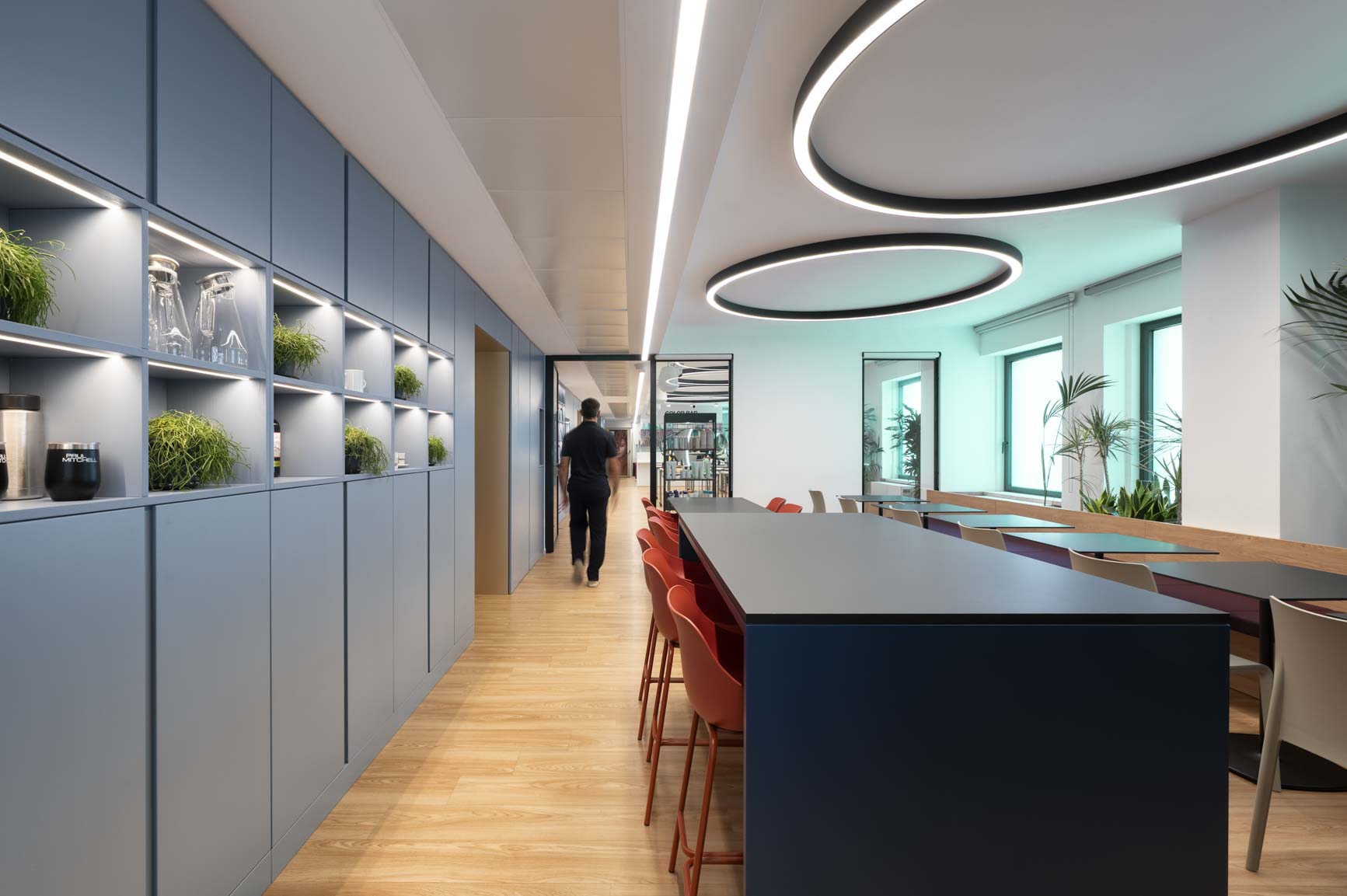
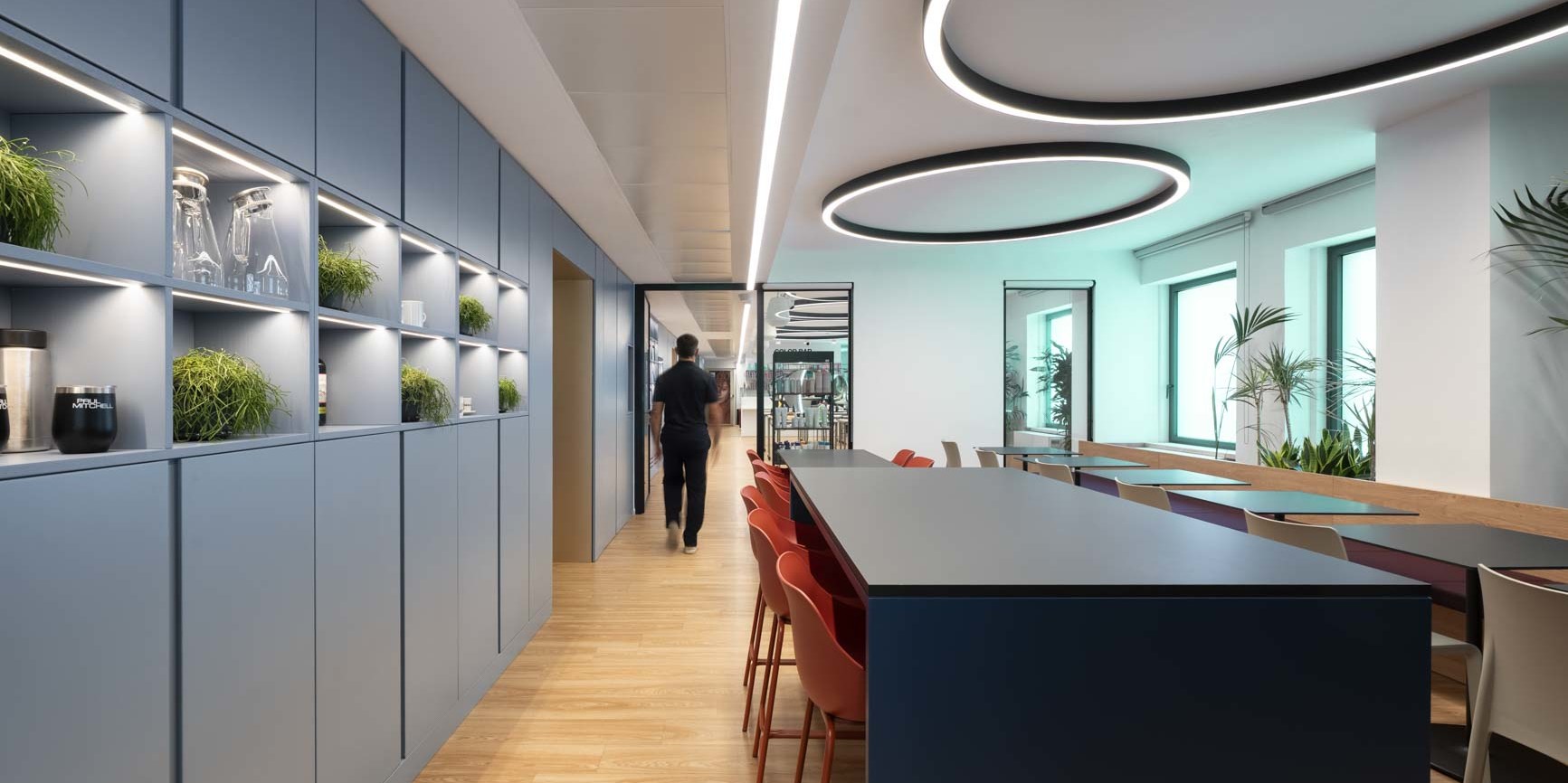
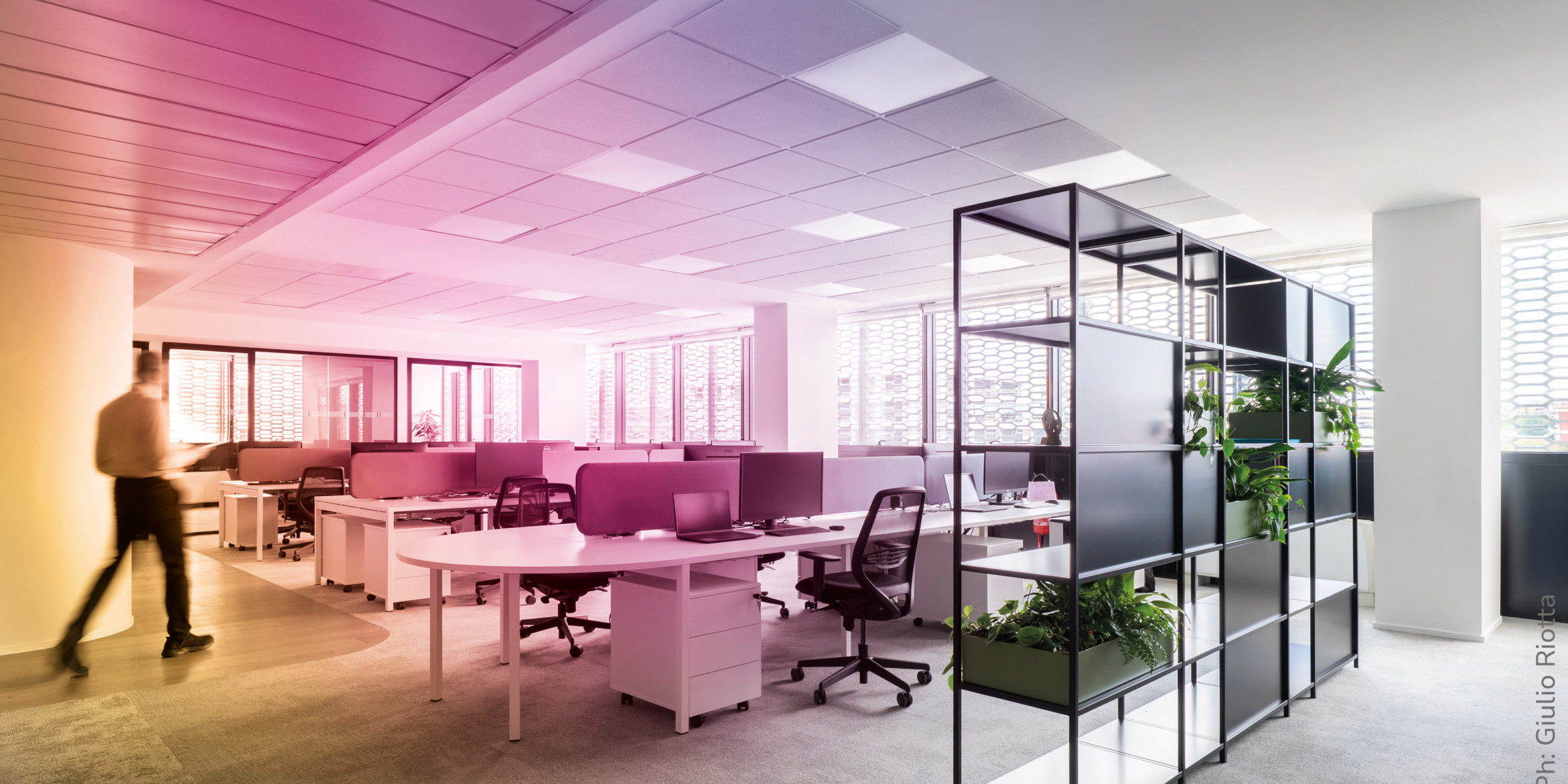
Behind the Scenes of the JPMS Project
“JPMS was, first and foremost, an exercise in coexistence between two very different entities.”
This is how Isabella Ducoli, Head of Design at Altis, opens the story of JPMS’s new Rome headquarters, the Italian base of the international haircare group.
On one side, there was a training academy: courses for hairdressers, workshops, brand experiences, technical demonstrations. On the other, the operational offices: marketing and corporate teams.
“They asked us for a single space that could host two functions which, in reality, require very different atmospheres and cognitive logics, all within the same building.”
The challenges: a promising yet contradictory building
The building offered clear potential, thanks in part to its three independent entrances, but it also presented significant design challenges:
- a single set of restrooms, insufficient for two autonomous functions;
- a very deep central area that was difficult to organise;
- a core occupied by technical rooms and systems, filled with heterogeneous elements and visual discontinuities;
- two very different views: one wide and open onto the square, the other screened towards the internal courtyard.
“It was a beautiful but disordered space,” Isabella recalls. “There were many elements pulling in different directions. Our goal was to make them work together.”
Altis’ design strategy: three moves that work as a system
The first move was the most structural, as it concerned the very heart of the building: creating a second set of restrooms to allow the two functions, training and operations, to coexist without interference.
“The building was very deep: we needed a second core to give autonomy to the academy and the offices. It was a technical choice, but above all an organisational one.”
With this intervention, the two entities finally achieved a coherent spatial distribution.
The second move focused on organising the views and their use as the true design matrix.
“The view onto the square was extraordinary: light, depth, horizon. That’s where the offices had to be. The academy, on the other hand, didn’t need a panorama: what matters there are the products, the screens, the learning experience.”
To mitigate the less valuable view of the internal courtyard, Altis introduced a continuous system of integrated greenery, filtering the light and improving the perceptual quality of the showroom.
Finally, the most complex issue was the central technical core: irregular, visually chaotic, interrupted by doors, systems and signage. Isabella remembers it well:
“It was a point that desperately needed order. So we designed an element that wouldn’t be just aesthetic, but efficient.”
This led to the creation of the Brand Gallery: a single, full-height volume running along the perimeter of the core. A solution that:
- reorganises the core, concealing systems and discontinuities;
- works as continuous storage for both areas;
- opens at strategic points to become a true showcase for JPMS products;
- conceptually connects the academy and the offices, becoming a narrative and operational backbone.
“Everything was very fragmented. The gallery became the element that brought order and told the brand’s story.”
The result: a project that holds two worlds together
Today, JPMS is a coherent space where different functions, perceptions and rhythms coexist without conflict. It is a project that shows how the Altis method can turn constraints into structure, and how internal spatial narrative can transform a distribution problem into a strong design identity.
If you’d like to explore the right approach for your own space, write to us at [email protected].

Beyond Human-Centric: Designing for AI and the Machine Era
For years, we have designed spaces starting from the human perspective, considering posture, needs, emotions. And that is still the case.
But today, a new actor has entered the workplace: artificial intelligence. It does not replace people; it multiplies their interactions and alters their pace. We are no longer alone in the room. There are now two of us: an emotional mind and an algorithmic one, operating according to very different temporal and functional logics. And this, inevitably, has a design impact. So the question becomes: what happens to space when two different intelligences coexist within it?

From the labs of the future to today’s desks
This is a topic also explored by Gensler in its research on “next labs”. From biotech to robotics, laboratories are becoming hybrid environments: automated processes alongside human decision-making, real-time data reshaping workflows, ecosystems of different intelligences sharing the same operational space. What is happening in labs today will happen in offices tomorrow.
This is where the Altis method finds a crucial role: reading the interplay between behaviours, processes and spaces, and translating it into a project that favours neither the machine nor the person, but the relationship between the two.
Designing for a dual intelligence
Here are the new design elements that come into play when creating environments where different speeds can truly coexist:
- Cognitive buffers Spatial interfaces that regulate the flow of information between humans and machines: transition rooms, decision-settling zones, areas where automation can slow down in favour of human judgement.
- Thresholds of attention Paths that separate moments of high computational intensity from moments of high emotional intensity. AI signals, suggests, predicts; humans integrate, evaluate and modulate.
- Asynchronous rhythms Spaces designed for work that no longer follows a single temporal metric: biological time (pause, posture, rest) alongside algorithmic time (continuous calculation). Design must harmonise these cycles, preventing overload.
- Human interfaces Areas where technology does not dominate but converses: screens that inform without overwhelming, predictive systems that do not interrupt, environments where the digital remains legible and governable.
The Altis method as mediator
When processes become hybrid and decisions move across two frequencies, a clear design posture is required. With its three-step Method Consult, Design, Deliver, Altis provides a framework to govern this coexistence. An approach that protects the human dimension by translating complexity into an ecosystem that is coherent, readable and inhabitable. Because as work accelerates into the virtual and AI-driven realm, the collective dimension tends to thin out. Physical space then becomes the necessary counterpoint: the place that reminds us that, in order to function, we still need one another.
If these reflections resonate with your workplace, write to us at [email protected]. Some conversations deserve to take shape.

The Comfort of Limits
There’s a strange kind of peace in limits. Perhaps because they remind us that everything, even the sense of freedom, needs a form. In architecture, as in life, constraints are not just barriers, but what allows thought to become design: the wall that defines space, the rule that guides creativity, the time that sets an end. We thought it was restriction; it’s really a matter of rhythm.
The limit as a frame
The Finnish architect and designer Alvar Aalto once said that architecture is born from respect for the material, and that material, by its nature, imposes a limit.
Think of the possible curvature of wood, the resistance of brick, the transparency of glass. It is the material itself, with its rules and its resistance, that turns an idea into form. The same applies to the mind: neuroscience shows that a finite number of possibilities enhances focus and reduces decision stress. Too many options, too many openings, and the brain short-circuits. The limit, then, becomes a cognitive ally, the condition that enables us to choose, to order, to create.
Containing to breathe
What if it were a matter of reversing our perspective? We live in a culture that constantly asks us to expand: to produce more, connect more, open up ever more. And yet, true wellbeing often stems from containment. Like in a Japanese Zen garden, where the boundary doesn’t close but directs the gaze, workspaces too can be conceived as limited yet generative ecosystems: not everything everywhere, but the right things where they are needed. Take a familiar thought: “How nice, now I can work from the sofa.” But do we really work well from that sofa? Total freedom only works as long as there is a context that holds it: a stretch of time, a posture, a threshold that distinguishes work from what is not. Context means constraint — some things I can do, others I can’t — and precisely for that reason I can focus, produce, and finally, breathe.
Measure as a creative act
There’s beauty in designing with measure: deciding where to stop, how much space to leave, how much time to dedicate. It’s an ethical gesture before it is an aesthetic one. The limit becomes a sign of care, a threshold that protects us first and foremost from ourselves.
And perhaps true luxury today is living within a considered perimeter, a space that doesn’t push us towards infinity, but invites us to find our own form of stillness. Let’s say it together: absolute freedom disorients; the right limit embraces.
The Science of Belonging
In one scene from Good Will Hunting (1997), an intense Robin Williams, in the role of the therapist, says to a very young Matt Damon:
“You’re afraid of what you might become if you let someone in.”
It’s not just a line about an untameable genius. It’s a line about trust: about how complex it is to grant it, to open up, to find your own place. At work, it happens all the time. We move between teams, calls, shared projects, and yet often remain on the emotional margins of what we build. Because to truly belong means allowing ourselves to be seen with our voice, our vulnerability, our presence. And we are not always willing to do that.
More than empathy: psychological safety
This is where the concept of psychological safety comes in, coined in 1999 by Amy Edmondson, Professor of Leadership and Management at Harvard: the belief that a group performs better when everyone feels free to speak up, make mistakes, propose ideas. Safety, not comfort. It’s not about eliminating risk, but about creating a context in which risk is sustainable. Where trust becomes a platform rather than a vague promise. If the fear of being judged shuts expression down, the certainty of being able to contribute multiplies it. It is precisely from this awareness that Emotion Based Working (EBW) was born: the approach developed by Altis to design spaces starting from the emotions they are meant to sustain. EBW turns what is often intangible into method: the relationship between architecture and emotional states. Designing places where people feel they belong, therefore, means giving shape to trust, empathy and shared identity.
Measuring the immeasurable
So can we measure “feeling part of something”? To some extent, yes. Neuroscience talks about hormones such as oxytocin and dopamine; psychology speaks of motivation; marketing of engagement. But the truest indicator remains human: the spontaneous willingness to stay, to contribute, to take care. In Altis projects, this translates into spaces that encourage encounters, but also individual recognition. Shared areas, yes, but also personal niches: because collective belonging can only be built if everyone can find their own place, physically and emotionally.
Belonging, in the end, is not a state. It is a verb in constant conjugation. A daily, quiet practice of caring for context. Because no open space, on its own, is enough to make us feel part of something, but a space designed around people can still make us say, with sincerity, “I feel good here.”
If this reflection feels even a little like yours, write to us at [email protected] and let’s talk about it.
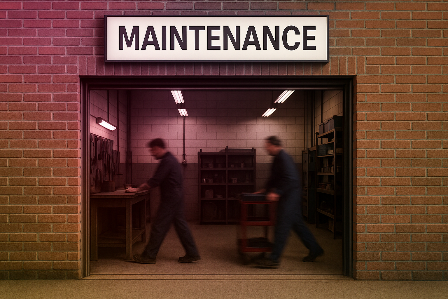
A Mental Maintenance Manual
Before you dive into this article, let’s run a quick check: a kind of inner service, in the form of an (almost) serious checklist to consult whenever you feel you’re overheating.
1) Notifications off, or are you still working inside the noise?
2) Inbox at zero, energy at zero too? Time for a reboot
3) If your chair squeaks… maybe it’s just you needing to stretch
4) Last mental pause: can’t remember? Then you’re overdue for one
5) Staring at the screen for clarity rarely brings clarity
6) Your brain runs on oxygen, not caffeine
7) A five-minute walk can solve what a one-hour meeting can’t
8) Multitasking: the fastest way to do three things badly at once
9) Silence isn’t empty, it’s part of the system reset
10) If you’re reading this during a meeting, congratulations, you’ve just found the most productive minute of it
If at least one of these lines has triggered a thought, it might be worth looking a little deeper. Because every day architecture designs spaces, inspects systems, checks certifications and safety protocols, but is it really able to maintain the minds that inhabit them? The brain, after all, is a precision machine. And like any machine, if it isn’t cared for, it breaks down.
Thinking, version 2.0
In engineering, preventive maintenance is the set of actions that help avoid a breakdown. Translated into the world of work, it means learning to spot the signals before they turn into blocks: information overload, loss of focus, pointless meetings, chronic multitasking. Altis also works on this plane, the plane of cognitive design, because a space only truly works if the people inside it are able to function well. Mental maintenance is, in every respect, both a technical and a human act: a regular check-up of the way we think, collaborate, act.
Lubricating the circuits
Like oil in an engine, the mind needs fluidity. Short, regular breaks; changes of posture; natural light; micro-movements: elements design can encourage and neuroscience confirms as essential to performance. Thinking does not regenerate under constant stress: it needs controlled friction and cooling points. Quiet areas, decompression routines and moments of recalibration, even a simple conscious breath, are all part of everyday maintenance.
Repairing, not replacing
In industry, the instinct is to replace what no longer works. With people, it’s smarter (and more ethical) to repair. Mental maintenance means recognising friction: a team that communicates poorly, a leadership that’s always “on”, an organisation that leaves no room for recovery, and intervening with precision, not punishment. It’s a shift in paradigm: from the cult of productivity to a culture of longevity.
Mental maintenance is an act of design care that Altis considers part of its method: Consult, Design, Deliver, useful especially when the construction site is still in our minds. To find out more, write to us at [email protected].

Through the window, beyond
If we asked Alfred Hitchcock for his idea of a window, he would probably focus less on aesthetics and more on perception. In “Rear Window” (1954) the window becomes a narrative threshold: it tells of the obsession with looking out, and the illusion that life is always more interesting on the other side of the glass.
And how much time do we spend looking out of the window? A universal gesture, full of breath and freedom, that we perform to carve out a moment of pause and escape. The window, in the office as at home, is not just a fixture: it is an emotional command, our own Ctrl+Alt+View. A tool that changes the way we work, think and even perceive ourselves.

Looking out as mental training
The point is that gazing outside interrupts the spiral of multitasking and opens up a new mental space. Neuroscience confirms it: looking out lowers cortisol levels, stimulates lateral creativity, and reduces the perception of stress. It’s not a whim, it’s biochemistry. Unsurprisingly, companies that invest in panoramic offices report better engagement and performance.
From the corner office to the basement
But not all windows are equal. We know it: some look out onto postcard-perfect skylines, others onto car parks or concrete walls. Yet the brain still plays its part. Any visual link with the outside, even a scraggy tree or a crow on the ledge, works as a reminder that the world goes on beyond the Excel file in front of us. It’s not just about the view, but about the possibility of an horizon, of perceiving the ‘beyond’ (we know, it may sound a bit New Age… but it makes perfect sense).
When the window is missing
And when there are no windows, the eye invents them: a graffiti on the wall, a tropical screensaver, even a brightly lit corridor can become substitute horizons. Do they work? Only up to a point. Without natural light and a visual link to the outside, productivity drops and psychological wellbeing takes a hit. That’s why the issue is not just aesthetic, but design-related: rethinking workplaces also means deciding how and where to open windows.
The window, then, is much more than a view on the world: it is an interface between inside and outside, between focus and escape, between the everyday and the dream. It does not solve all the problems of contemporary work, true. But it remains a fundamental element of our daily wellbeing. For everything else, Hitchcock’s lesson still holds: the outside we observe is only a pretext, because the real scene always takes place inside us.

The Hidden Site
Every architectural project has two faces: the one on show, made of forms and materials, and the one that stays backstage. We’re not talking cranes and hard hats, but that grey area of permits, logistical dovetailing, teams co-existing and the management of the unexpected. It’s the invisible side of building: the part that never appears in the renderings yet decides a project’s fate.

Bureaucracy is not a detail (No, really.)
Forget reinforced concrete: the first real wall is paper. Stamps, authorisations, regulations. Not the most glamorous bit, granted, but without it nothing moves. And ticking boxes isn’t enough: you need to read the system’s fine print, anticipate friction, use the rules of the game as your compass. In other words, the legal backstage is already part of the project.
Logistics: the Tetris no one imagines
A building site isn’t just construction: it’s a choreography of materials, equipment and people. When logistics work, no one notices; when they don’t, everyone remembers. The backstage is an exercise in synchronicity: coordinating suppliers, managing access, keeping to schedules. A less tangible art, but a decisive one.
The unexpected isn’t unexpected
In theory they’re obstacles; in practice, they’re the norm. Delays, supply errors, structural surprises: every site knows them. The difference lies in preparation. Reading complexities early, anticipating criticalities and steering them through to handover is what separates a loosely organised approach from a solid one. We call it Consult – Design – Delivery, and it works because it sequences what usually stays disconnected: we read real requirements and the context’s rules before we draw, we design choices that simplify logistics and reduce snags, and in delivery we coordinate timing, players and surprises under a single direction.
If you’d like to see how Altis keeps the visible and the invisible sides of a project together, write to [email protected]
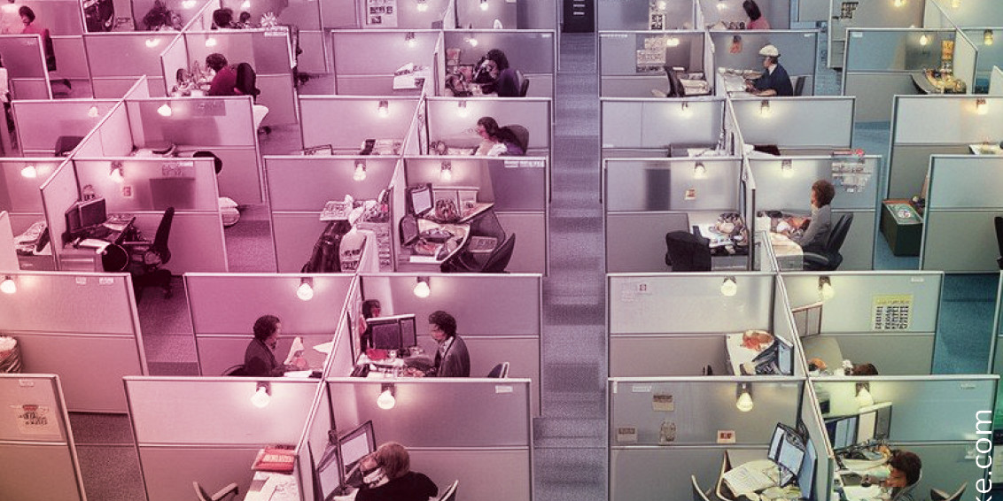
Open Plan, Closed Minds?
Chairs that swivel, desks without borders, and the promise of endless brainstorming. That’s how the open space was sold: the ultimate solution to make companies more collaborative, dynamic, “cool”. And the reality? The soundtrack is noise, distractions, loud phone calls, and noise-cancelling headphones as the only form of self-defence.
The open space has become the standard, but that doesn’t mean it always works. In fact… often the opposite is true.
The myth of perpetual collaboration
In the 1990s and 2000s, open spaces embodied an almost utopian vision of the office: no walls, no barriers, just colleagues ready to share ideas as if they were sweets. In theory, the formula was simple: more proximity = more collaboration. In practice, more proximity = more coffee breaks and chit-chat. The myth of spontaneous interaction has often turned into a trap: the open plan doesn’t guarantee exchange, but interruptions.
White noise or black noise?
The problem is not just organisational, but cognitive. Every interruption breaks what we might call “attentional cycles”: a recent study from Toggl Blog suggests it takes on average 23 minutes to regain focus after a distraction. Multiply that by ten micro-distractions a day and it’s clear why phone booths have become the status symbol of the open office. The promise of collective energy easily turns into white noise, on a good day, or black noise, the kind that burns time and patience.
Not open vs closed, but plural
The point is not to choose between walls or open spaces. The issue is more subtle: designing environments that respect people’s different cognitive and emotional registers. Some need isolation to concentrate, others thrive on sharing to generate ideas, others on movement to find energy.
This is where our approach, Emotion Based Working, comes in: reading and designing spaces starting from the emotions they must sustain, not from the architectural dogma of the moment. There is no single model, but an ecosystem of possibilities. Closed rooms, hybrid areas, private corners, fluid zones: the real office is not a spatial dogma, but a set of conscious choices.
Do we want to admit it or not?
The open space was the symbol of an era, probably over. Working well today means creating environments that know when to open and when to close. Because in the end, true collaboration goes far beyond desk layouts: it is born from the design of a space that respects different ways of thinking and working.
And if this topic intrigues you, write to us at [email protected]. we promise a conversation more stimulating than an improvised brainstorming session at the coffee machine.